United Kingdom 2012: My Trip Report
Up until May 11, while my mind had wandered and my research had extended my reach far beyond the borders of the United States, my physical being had never stepped off of the North American continent. And while I had explored bits of Mexico and Canada, my international experiences were of the pancake variety (that is, the International House of Pancakes). But with an invitation to present my research at the University of Wolverhampton for the Centre for Art, Design, Research and Experimentation 4th Annual Research Student Conference in Art & Design hosted in Wolverhampton, UK the scope of my international experiences was about to expand beyond the cheese blintz and boysenberry syrup (who eats that stuff, anyway?).
Between May 11 and May 18, as I experienced everything from airport queues to HP Sauce, I tried to look at things through as many lenses as possible which allowed me to gain some very unique perspectives along the way. Over the seven days, I used my vision as a designer, a cultural anthropologist, a consumer, a student, a tourist, a parent, a writer, an American (but not an obnoxious one) a researcher, and an educator. Much like what theory affords researchers in the way of opening up new ways of seeing things, the lenses through which I challenged myself to view the world around me revealed some enlightening findings which have since altered the way I see the world. In the interest of reporting my findings so they may benefit others (and so I also will not forget them) I’m sharing some of them here:
The Trip
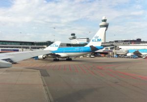
My itinerary delivered me in Birmingham, England via Amsterdam flying KLM. I had always wanted to fly KLM since my grandfather had reported rave reviews from his travels to the Persian Gulf when he worked on oil rigs there in the 1970s and 1980s. As a longtime Southwest Airlines flyer and having worked at Southwest for a year, any time I fly I can’t help but examine the airline’s culture and customer service. I will admit, as a designer I have always been wooed by the KLMs colors (which probably comes as no surprise considering I still LUV Southwest Airlines and their Desert Gold and Canyon Blue). From their candid and engaging blog (KLM Blog), extensive use of social media and forays into using social media as a way for passengers to choose their seatmates via their Meet and Seat initiative and cohesive onboard implementation of the KLM brand from the inflight meal containers to the personal entertainment interfaces and corporate videos, the airline proved to be one which is acutely aware of the value of consistent brand and exploration into new ways to connect customers to that brand.
Ambiance

While getting comfy in my seat on board the aircraft preparing for my two transcontinental flights, I was intrigued by KLM’s boarding process and its effects on passengers. The ballet of passengers lugging handheld luggage onto the aircraft, hoisting those pieces into the overhead bins, and/or stuffing them under seats is quite the same on a KLM flight as on any other airline I’ve experienced, this opening act of the flight is done to music. Literal music. From a bit of research, I’ve learned that this is fairly common though it’s something I’m not used to and I found it refreshing. An air travel aperitif if you will.
However, more intriguing than the overture to our travel was the video shown on the inflight entertainment screens. The footage show was purposefully candid, as if it was unedited video taken from someone’s video camera or phone. The scenes were decidedly Dutch: a sailboat cruising with its pilot and friends waving to picnicking onlookers sipping wine, a group of friends goofing off, laughing, and taking photos of one another at the I Amsterdam sign, and other scenes of the like. These images feel like vacation, fun, relaxation and they brought a celebratory feel to the inauguration of the flight experience.
As the aircraft neared readiness for departure, the scenes turned to those of KLM employees loading luggage carriers on aircraft, a pilot doing a visual check of the wing, and of other ramp employees refueling or pushing an aircraft back from the gate. The scenes weren’t close up or glamorized, but were shot from a distance just the way these activities would be seen from the aircraft or gate, helping them to feel like an observed event instead of a staged one. As a passenger, these images of readying aircraft, though not at all of our aircraft, helped distract viewers to make time pass more quickly, but also by the fact that they were “readying” images, I believe they did the work of helping show passengers that while we were sitting in our seats doing the waiting, there were things that were being done to make our travel possible. The music and video combined reminded me of in-queue experiences and pre-shows at Disney Parks which cleverly entertain guests while they are waiting, helping make the experience of waiting for the main event more bearable.
My Itinerary
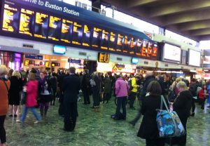
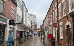
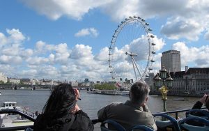
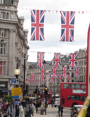
My trip placed me in Birmingham, followed by a 30-minute train to Wolverhampton where I spent three and a half days. After arriving I had a chance to sleep a bit, to review my presentation and make some refinements, to sleep and watch television that had way too few advertisements and commercials (I’m kidding), and then a couple of days in Wolverhampton for the conference. On Wednesday morning May 16 I boarded a train for London at 5:24 a.m. which only cost me 11 pounds and then spent roughly 36 hours in London seeing as much as I could in a short amount of time. After a train ride to Birmingham at the conclusion of my 36 hours, I was up at 3:00 a.m. to head to the airport for my flight to Amsterdam and then back home.
The Conference
I submitted the abstract for my paper to the conference at the recommendation of my advising professor at the University of North Texas who had noted that the conference had gained a significant reputation as a quality forum for exchange. My paper topic for the conference was titled “Responsive Web Design and a New Web Aesthetic” based on my work in responsive web design and my findings on the state of web design in light of the proliferation of mobile devices. More on this in other posts at another time… this post is focused on my experience while in the UK.
Upon my arrival at the School of Art and Design at the University of Wolverhampton on the first morning of the event, I realized that the next two days were about to bring with them some very unique opportunities. Scattered around the café area of the School of Art and Design sat roughly a dozen individuals drinking tea while reading through the conference proceedings. Considering I was roughly ten minutes early I realized that the attendance for the conference was going to be significantly smaller than I had expected. However, over the course of the two days, the fact that there were “only” 30 or so Ph.D. candidates engaged in the conference reaped rewards I had suspected may come to fruition: over the two days I had a significant conversation with 90% of them, had conversations lasting over half an hour with a third, and spent hours discussing research with five candidates with whom I have since shared contact information, research findings, and ideas which have sparked new discoveries on both sides of the “pond.” To this end, what the conference held in its size it made up for in quality.
Over the course of two days, I heard some fascinating and innovative research from PhD candidates in Art and Design from across the UK. I found that research was largely grouped into several groups including topics in the performing arts, fine art history, a process-based study in the arts and curatorial research. As a design researcher, it’s of no surprise that the work of other students on design especially piqued my interest.
Among this group I heard some fascinating research for design, about design, and through design:
Two Ph.D. candidates at the University of Dundee presented on the early stages of their work with the Victoria and Albert Museum where they are using design research to begin to shape and inform plans there for the development of the V&A at Dundee, which will feature design exhibitions but is also planned to be a hub for innovation in the area. The project brings with it some challenging opportunities in how the project may best serve the needs of stakeholders, designers, and visitors alike and also how such a museum can escape the stigma of being just a showplace but can instead become a catalyst for community development and design innovation. Joanna Bletcher and Saskia Coulson’s presentation highlighted the framework for the research and I was challenged by the ideas they have begun to explore as the project takes shape.
While she is in her first few months of study and did not present at the conference, I enjoyed a lunchtime discussion with Carol Meachem, a PhD candidate at the University of Wolverhampton who is beginning her research into processes of creativity specific to graphic design practice. Much like myself, Carol is also currently teaching courses in design and at one point our discussion turned to our experiences in the classroom. I especially appreciated Carol’s perspective on how effective design education should do the work of educating designers and not training designers. We were in agreement that programs that train designers may build skills into students, but it falls desperately short of the more important work of shaping educated designers who can understand the value of and can execute compelling conceptual work while also becoming self-guided in their pursuit of effective and unique solutions.
Jona Piehl, a Ph.D. candidate from Central Saint Martins College of Arts and Design in London shared her early work in exploring the role of graphic designers as co-curators in museum exhibitions. She is exploring the “voice” of visual design and the challenges inherent in museum display venues where the voice of the narrator, the voice of the history surrounding artifacts, and the voices of the artifacts themselves can create a rat’s nest of messages. I found Jona’s work highly valuable for the work of implementing clearer communication in these spaces through graphic design and am intrigued to learn what she will find as she assesses needs, uncovers trends, and activates design practice in the work of more effectively communicating the variety of messages needing to be shared in complex museum spaces and exhibitions.
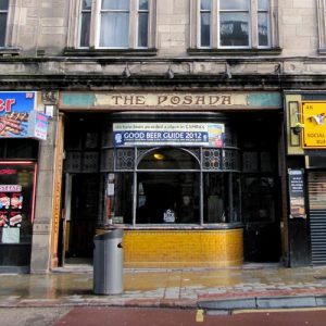
Whether it was in the auditorium, in the School of Art and Design café during the hourly 30-minute breaks from presentations where side conversations took place or discussing with others over pints at The Posada, conversations ranged across disciplines as varied as the participants’ personalities. Gemma Collard-Stokes from the University of Wolverhampton shared her work on the reflexive role of creative writing and how it can lead to new performance directions in the performing arts. Anne Burns of Loughborough University shared her exploration into Facebook as a fabrication of personal identity. Christian Parreno, a Ph.D. candidate from University College London presented his research exploring the nature of boredom and its potential applications in the arts and design. In conclusion, the conference was more than I expected: an exchange of ideas and potential partnerships for future research and exploration.
The United Kingdom
Everywhere I went in the UK, whether via aircraft, train, bus, or by foot, (and by gosh, I did a lot of travel by foot) I encountered nuances of the culture which shed some light on how very IHOP my life had been (not to say I have stepped all that far out, of course). Still, a smattering of observations rendered some very unique questions, thoughts, and perspectives:
Green Spaces on Buildings
I come from Texas, which for the most part gets and stays dusty most of the year. But in London, it was green, lush, and frankly, pretty cool though I didn’t see any rain while I was there. One thing that made an impression on me was the use of greenery, usually real but many times artificial, on balconies, in window boxes, on rooftops, and in a variety of other placements. These spots of green brought the texture of plant matter up onto the usually stone or brick buildings, breaking up the hard surfaces and introducing organic matter which made city spaces feel more livable.
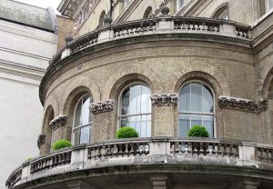
Unlike American cities, I appreciated that most of London (and Wolverhampton for that matter) was comprised of low-lying buildings. In Dallas and Chicago, the two American cities with which I have the most experience, skyscrapers create a cage for inhabitants, closing in the viewer and blocking out the sky. They belittle the individual and, like pine forests, block out light so anything wishing to grow or thrive in the underbrush has to do so in the darkness. Not so with London, the sky is present, open, and is part of one’s interactions even though they are in the middle of a massive city.
My observations and visit were timely, considering I had recently been reading Robert Grudin’s Design and Truth on my flight to the UK. Grudin’s book starts off by asserting how design should be in harmony with its environment and by doing so, that design will be more successful in meeting its goals. My trip conveniently put tangible the things Grudin had explored in his book.
International Awareness

North America is pretty isolated from the rest of the world… but The United States is most definitely isolated from even North America. In the UK, it is apparent that there is an awareness that there are other people out there who don’t speak the same language, don’t drive on the left, don’t like HP Sauce (how could you not!?) and don’t drink tea. This is apparent just by walking through pubic spaces in the UK. When walking up to a crosswalk, most will have painted in the ground “Look Left” or “Look Right” depending on your point of entry. While these bits of warning are probably lost on Britons, as a non-left-driver I appreciated them as I’m sure do Europeans and others who drive on the right and in turn, think to look left first when crossing. Through observing a number of other design decisions that revealed the nation’s international awareness I was challenged by how isolated Americans are from our neighbors and in turn, may be missing opportunities to make our constructed environments more livable for those who do not live in the United States.
Watching Their Language
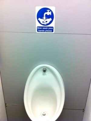
I found the British use of the English language through their directional signage to be quite fascinating and very different from how it is used in the States. On the whole, the word “please” is used regularly in directional signage. My hotel room in Wolverhampton asked me to “please be sure the shower curtain is inside the bathtub,” a sign in a Boots store (a pharmacy like Walgreens in the US) asked me to “please pay here” and even a urinal at the School of Art and Design at the University of Wolverhampton politely asked me to wash my hands. It challenged me to question… can signage that uses polite language be more effective in gaining compliance? And if so, is it any “slower” or does compliance take place at the same rate? In the US, signs usually just tell you what to do, in the UK I found politeness as a very considerate way to encourage users to comply.
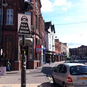
I found the use of the words “kill” and “dead” to be curious when tied with functions of stopping or slowing. Several times I saw road signs that quantified the required driving speed to be “Dead Slow” and in Wolverhampton I found a sign that charged drivers to “Kill Your Speed.” While eating at Nandos, I noticed what we in the US would call the “gas shut off valve” was a “kill valve”. As a writer I found these uses of language to be foreign from what I am used to, but still extremely effective in quantifying the intended result. In all I feel it was a fascinating look at the way we use language and how words can have the same forms but can take on completely different meanings when filtered through culture.
Hodgepodge
The week I spent in the UK expanded my perspective on the world, comprised of both major epiphanies and little discoveries. To run through those observations in quick order so I may bring this post to a close, I’ll address some of those little discoveries here:
- Walking in London means you have to be an assertive pedestrian. Walk with purpose… there’s no room for ambling or lollygagging.
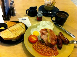
- I really liked the food in the UK. It’s hearty, warm, sticks to your ribs and always goes with a pint of whatever. Some have claimed it to be “bland” but bangers and mash, fish & chips and beef bourguignon pie, while pub food, reminded me of my favorite comfort foods here in the States.
- The best thing I ate on my trip was a creamy cheese lasagna followed by the best tiramisu I’ve ever had at a little place called Ponti’s in London, just off of Oxford Street and Duke. Apologies to my previous bullet point.
- My greatest achievement was having some Americans stop me near Piccadilly Circus saying “do you live here, we need some help.” Once they heard my accent they realized that the Londoner persona I had assumed was legit.
- Automated Teller Machines are everywhere. Unlike American banks where you walk up and there’s one ATM, many banks in the UK had three to as many as 10 ATMs. I get the feeling that cash is their preferred method of payment. I wonder how this translates to how people in the UK feel about debt and credit.
- Wear comfortable shoes. I did. They betrayed me. I was dying for a comfy but still stylish pair of Clarks by my 24th hour in London. The blisters I earned were the stuff of legend.
- When I did get some pound sterling it felt like I was at the State Fair of Texas getting tickets to use for food. The money was so foreign to me that it didn’t feel real. I’m interested in exploring the role of context in how people perceive things of value.
- I felt most out of place when I wore my sunglasses… while they are part of the uniform in Texas, they are not common in the UK.
- Everyone I met was friendly and open. I can’t wait to go back.
In all, this trip was a rewarding experience on many levels. I’m thankful for my wife who held down the fort and took care of everything at home so I could go. I’m thankful for the other students at the conference for their openness and time spent in discussion. I’m thankful for the University of North Texas and the College of Visual Art and Design for their generous funding which helped make the trip affordable.
And I’m thankful for discovering HP Sauce.