Hierarchy: A Class Experiment
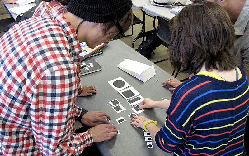
Challenging students to create order, especially when its tricky.
This semester I am teaching two sections of Typography in the Communication Design program at the University of North Texas. Like most of the courses in Comm Design at UNT, my Monday/Wednesday/Friday classes are one hour and 50 minutes of nonstop discussion, critique, banter, and learning. On October 19, 2012, I challenged my students with a collaborative, in-class exercise that I had hoped would give them deeper insight into the implementation of visual hierarchy, meaning-making, and cultural sensitivity.
The Challenge
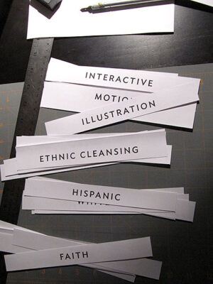
I started the experiment by splitting my classes of roughly 17-19 students each into four groups. A few nights before class I created four sets of slips of paper, each centered on a different content area that would serve as the focus of each phase of the exercise. Phase one’s content was composed of a series of shapes and the other three phases were groupings of words, all printed on slips of paper, trimmed, and then placed into paper bags. This resulted in 16 bags total, four per class group, and one per phase of the exercise.
For each phase, groups of students were tasked with creating a visual hierarchy of the objects in their bag by pinning them up on the critique walls of the classroom. Students had roughly 10 minutes to work together to make sense of their assigned objects or words and to create an order of them. With each bag came a new challenge and after each challenge came to a discussion on why the groups ordered the content in the manner they did and what they learned from the process.
Hierarchy: Order Without Guidance
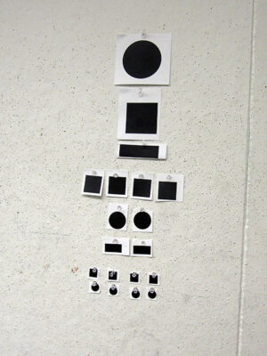
The first phase bag contained a set of circles, squares and rectangles of varying sizes. With no prior direction, students spent time shifting the objects around on tables and on the walls before they began to make order of the objects and began tacking them to the wall in their final hierarchies. The most difficult component of this phase was the fact that there were several rectangular objects that carried the same mass as many of the other objects yet they did not “fit in” as a circle or a square. The discussion that followed focused on the decisions students made in ordering the objects, why they chose the arrangements they did and if other students could make sense of their hierarchical solutions. During this phase, students learned first-hand how designers are often given content that doesn’t always come together neatly and perfectly.
Mixed Meanings
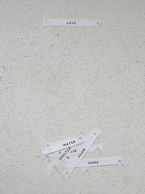
Phase two bags were the first set of words that student groups had to work with. For this round, each slip of paper carried a different word including:
Air
Food
Faith
Hope
Love
Shelter
Water
This series of words was an intentional mix of physical and conceptual content and each group of students grappled with their complexities in vastly different ways: some chose to create hierarchies that communicated a central concept and others visually ordered the content to delineate measurable relationships between the items in a more traditional application of hierarchy. Regardless of their solutions, students in each group had to share their reasoning with one another in an effort to come to a consensus.
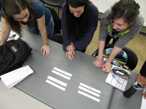
This round produced a discussion on meaning-making and designers’ roles in shaping the meaning of the content they communicate. While the words themselves could have been ordered in a vast number of combinations, we discussed how designers have the responsibility of deciding which order is most effective, often with very little guidance but not without consequences. After all, what designers choose to highlight and not to highlight drastically influences the message and those who receive it. But because this exercise had no client, students had to decide among themselves what the most ideal arrangements and messaging would be which prompted a great deal of banter about meaning and order. Through the banter, students had an opportunity to learn more about each other and about the process of working in a collaborative environment where not everyone thinks or believes the same way. This would go on to be the theme for the day.
Making the Best with the Worst
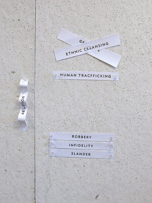
Phase three brought with it some challenging concepts but also some rich lessons in how designers often have to communicate charged concepts that can sometimes be personally offensive. The series of words contained in bag three were:
Abortion
Ethnic Cleansing
Genocide
Human Trafficking
Infidelity
Robbery
Slander
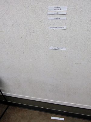
Students all agreed that the words in this grouping were negative-feeling. Of the words, “abortion” was one of the most challenging for students as it brought to the fore their diverse moral perspectives on the topic. Through this phase, each group of students addressed “abortion” in various ways: several solutions commented on its position by casting it to the side or applying it to the wall in an uncertain arrangement. A few groups of students lumped it in with the other words as they created taxonomies of ordered concepts on a scale from those that posed the least to greatest mortal danger. However students decided to approach the problem of ordering challenging ideas, their intended meanings came through clearly through their work.
In all, this set of words prompted a discussion on the power (and responsibility) designers have via the work they produce. While the order the students created lasted only 10 or 15 minutes up on the wall affecting 19 or 20 people, the decisions designers make in how they choose to address sensitive topics can affect a very broad audience, which highlights the responsibility designers have in considering their actions.
Culture Construction
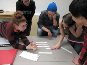
The final round brought with it the greatest number of groans as students opened up their bags to reveal their words. Once the slips of paper slid out onto tables the head-scratching began, but what resulted was a valuable lesson and a human result. Words for the final round were:
African American
American Indian
Asian
Hispanic
Pacific Islander
White
As I walked around the classroom, I observed my students grappling with the task: they were very reluctant to create hierarchies of races as it would communicate that one people group was more important or at least “better” than another. But as students discussed their plight, they began to identify the power they had via hierarchy… that while hierarchy is an ordering of content that most often means that one component is privileged over the others, it also meant that via hierarchy they could show how groups are equally enabled. The results honored humankind and brought with it a robust discussion.
Through the “race cards” we talked about how designers are culture creators and how the decisions designers make have the power to establish norms, supporting one group of people as “ideal” while alienating others. I took the opportunity to interject how many of my students may someday be directing photoshoots and directing which image resources to use and which ones to ignore and how those decisions have power in the public as they add up to shape culture, itself. With this final phase, I challenged students to be aware of their decisions and the power they would have in influencing the ideas of others.
Reflection
In conclusion, the exercise prompted discussion and challenged students to collaborate in a class where most of the study (aside from critiques) is largely individual. It also highlighted the power of words in carrying meaning and how those meanings can be very different from person to person. The result was a session where the aesthetics of design were set aside for a day and the thinking behind it came under the microscope. It is my hope that as my students continue to move forward with their careers (whether they be in design or not) they will remember their personal responsibilities in measuring the ways they construct meaning.
The philosophical foundations that underpin this set of assignment parameters are, unfortunately, far too rarely broached in far too many contemporary undergraduate visual communication learning environments. Sensitizing vis comm design students at this level to the broader socio-cultural ramifications that their design decision-making processes have on broadly constituted arrays of audiences is something that many design education have called for for years, and it was actually achieved here. The fact that this was orchestrated in a pedagogic context as straightforward and “fast” as this one was, wherein the students were ALSO introduced to the essential formal principles necessary to establish hierarchies of meaning, means that this endeavor also yielded a powerful secondary benefit.