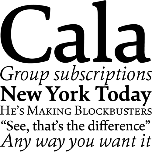
Reviewing Cala
A review of Hoftype's modern, classic typeface.

You’re reading Cala and you may not even know it.
When I worked through the process of designing this site I looked long and hard for a serif typeface for body copy. I wanted one that would be clear and easy to read, had a full set of characters including small caps, felt classic and refined but with a modern bent while working on both the web and in print. Hoftype’s Cala won the day and I couldn’t be more pleased.
Today, designer and design historian Paul Shaw posted a review of Cala where he addressed Cala’s character and its lineage. Read the full post at Typographica.
Be the First to Comment