2011 Christmas Card Critique
Our first ever awards for the best Christmas cards our family received.

Each year, my wife and I enjoy seeing the bevy of Christmas and Holiday cards come in. We lovingly display each and every one on our kitchen pantry door and enjoy hearing from our friends, family and insurance agent (yep, we always get one, too). But this year as we looked them over my wife and I decided we would start a new tradition:
The Cheatham Christmas Card Critique
We looked over all of the cards we received this year and grouped them into three categories: traditional cards, photo cards, and clever cards. My wife and I discussed each card carefully and chose a winner in each category who moved on to the best in show competition, rendering the award for best Christmas/holiday card we received (this year). The cards have had the names removed to honor the privacy of our family and friends, just in case they aren’t as open to identity theft as we are.
Here’s the 2011 Christmas Card Critique!
Best Photo Card

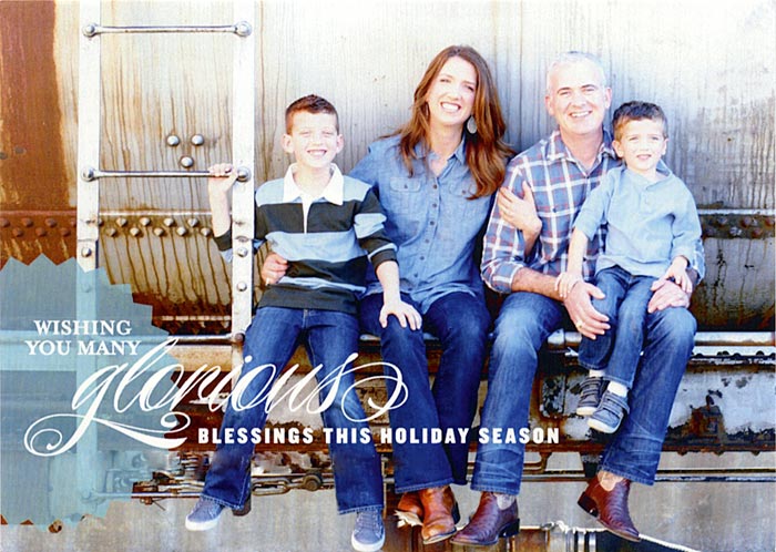
“Glorious Blessings”
This card, a Stacey Day design produced by Shutterfly showcases some sensitive typography combining serifs, sans serifs and a custom-looking script, supporting the photograph while not distracting from it. A single photo was used ensuring the card didn’t get too busy and the photography and styling has a friendly feel thanks to the family’s casual dress and the not-too-industrial, vintage scene. The sentiment is well-written and concise, with “glorious blessings” at its core amplifying the extent of the well-wishes to an extreme and abundant level. All together, this card was Christmas-y without relying on clichés and avoided getting too “look at me” in the way it used photography.
Best Traditional Card

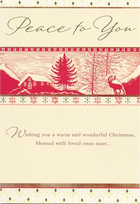
“Rustic Christmas”
We didn’t receive many cards in the Traditional Card category this year but of them, this DaySpring card was the most successful in wishing Christmas greetings with style. The simple color palette kept this card from being too busy and also helped give it a classic feel, supported by the winter woodcut scene. The card does get a little busy through its use of four different kinds of borders and two different sentiments, but the woodcut and snowflakes help ground it as decidedly rustic and traditional.
Best Clever Card

“Christmas Scream”
We always receive cards that are funny/clever, and this year’s winner shows how you can take a “challenging” photo with Santa and make it something so much more. By using the sentiment “Hope your Christmas is a scream!” the senders of this card took the “lemons” they were given and turned them into lemonade. We’re glad they did because we got a big laugh out of the terror shown on this kid’s face. Even more funny is the fact that no one else even seems to mind that he thinks the man with the bag is going to devour him.
Best in Show

“Glorious Blessings”
Props and thanks to the senders of this card for decking our halls so nicely. This card won Best in Show because of its simplicity, quality of production, well-executed typography, and cohesive, friendly visual presentation.
See you next year!
Here’s wishing you all a Happy New Year. As always, our Christmas cards will be sent out in July to bring you a few glad tidings when it’s needed most: in the middle of our 110-degree Texas summers.
Love the card critique!