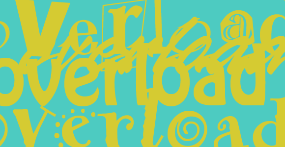
Type Overload: A Cautionary Tale
Just say “no” to more bad type.
Have a seat and listen to my story of a man who had too many typefaces.
It began when he was a young design student and he purchased a copy of Photoshop 3 and a copy of Illustrator 5 and to his delight, they both came with fonts. A lot of fonts. And thus began his hunger for typefaces, cramming his Power Macintosh 7200 full with as many freeware and shareware fonts he could find. He was so excited because he had seemingly limitless access to typefaces for just about any kind of design job.
As the years passed he carried these typefaces with him to different employers, used them for freelance design work, and was able to afford a few expensive typefaces that he really liked. The typefaces lived on floppy disks, zip disks, CDs, firewire hard drives, USB hard drives, firewire 800 hard drives, and internal storage devices of all kinds. So many Arks carried the mass of type he had collected.
But the truth was, he only used a small fraction of the full collection of type. While he knew he had several versions of the typeface Hobo, as well as a few knockoffs: he couldn’t bring himself to use it because it was hideous. He found himself with a pile of type that he could no longer wade through. The good typefaces were buried in a mass of over 11,000 duplicates, knock-offs, missing files, and altogether sucky excuses for typography.
So our now middle-aged designer spent two weeks sorting, trashing, weeding through and condensing the heap that he had carried for so long. He tossed copies of Lullaby, Pinwheel, Kool Ding, and Lord Haw Haw. Waded through duplicates of Helvetica Neue, Helvetica New, Helvetica New New, and New Helvetica. When he came to an Open Type Font he kissed it and patted it on the head, and he cursed True Types and archaic fonts that no longer worked and deposited them in File 13.
It was an arduous process, but he had so much type that he could no longer find what he wanted. And when the job was complete, he was exhausted, pleased, and bewildered that he had so many typefaces that were crap. He was finally free, and his hard drive felt lighter. The burden was lifted, and when he went to design a poster for an event that needed a modern feeling typeface that was friendly but hearkened of the 1930’s, he knew where to find it.
So friends, please learn from this designer that because you can get the typeface, doesn’t mean you should. Ponder your future and how heavy a pack you wish to carry on the journey ahead before you go to dafont.com and download a butt load of handwriting fonts just because you can. Consider how many times you’ll use that condensed, rounded, extra light, extra wide, oblique, small caps, expert version of Helvetica Neue before you buy. Saying “no” today will save you from hours of wasted time sorting through the heap of a collection gone mad.
Be the First to Comment