In early 2015 I received a letter from Nielsen, the company known for its television ratings and widely regarded as the authority on measuring television-watching behavior. Inside the envelope were a few perfectly crisp Dollars and information on how our family had been selected to participate in a Nielsen survey. As a design researcher, I was excited to find out how Nielsen structured their survey instrument and as a TV watcher I was interested to peek behind the Nielsen curtain I had heard about for so long.
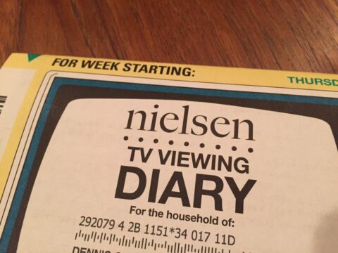
When Nielsen’s packet with the TV Diaries arrived I opened it up to find the year 1981 waiting inside. The prominent graphic on the front of the paper diary was a television—not an LCD screen as I had in my living room but one I remember watching when I was seven. The image of the TV screen was illustrated in all its 4:3 aspect ratio glory, the inside screen area rounded off, smacking of the CRT television I had in my dorm room in 1994. It was an image of a television set. In an era when we watch screens (first or second screen, your pick) the idea of a bulky television set felt metaphoric and a bit trite.
Based on its nostalgic visual design, the survey instrument felt like it would only allow me to input how much Quantum Leap and MacGyver I would watch in a week’s time. When I opened the paper folio it had instructions that referred to “VCR” and “cable box” so I could properly record my family’s watching habits. It provided detailed scenarios for what I should do if I were watching a previously recorded show or a movie from physical media. Brightly colored triangles and bold type directed me through the document, highlighting where to start and where to stop. But when I looked for a spot to record all of my Netflix binge-watching I quickly realized the thing in my hand was truly from the past.
No room for streaming. No room for Unbreakable Kimmy Schmidt or Eureka. My kids’ Saturday mornings of rapid-fire Lab Rats and Wild Kratts episodes had no place in the Nielsen TV Viewing Diary. So I did what any person would do, I tweeted my thoughts:
My Nielsen TV viewing diary makes no mention of streaming content. Feels so 20th century. #wkbnch
My plan for the tweet was to share how out of touch “the experts” were, highlighting the importance of relevant survey design. The tweet was retweeted five times, favorited by a couple of users, then disappeared into the milieu of the Twitterverse. I went about my week charting my family’s TV watching habits as best I could. Each time I entered information I wrote “streaming” and “Netflix” where it wanted me to input the television channel (our family has an antenna but it only gets used when thunderstorms are approaching). As I scribbled streaming show after show into its tabled grid I winced that someone at Nielsen would have to decipher how to input my data. After the week was over, I mailed the diaries back to Nielsen to join the rest of their kind.
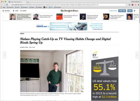
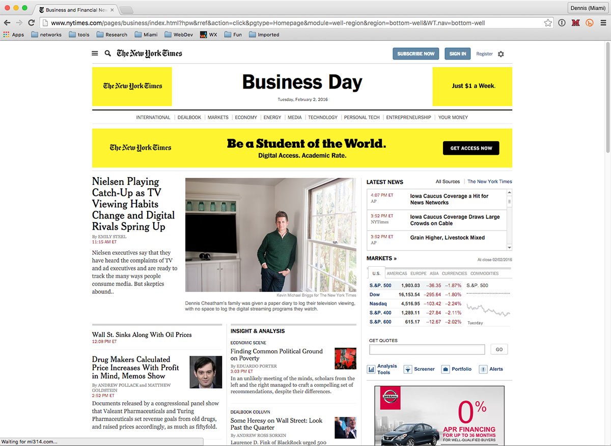
A few months later, I was contacted about my Nielsen tweet by Emily Steel, who writes about television and media business at the New York Times. She was working on a piece about Nielsen and interviewed me to get my thoughts about the TV Viewing Diary. Over the course of the interview, I was part TV-watcher and part design researcher, bouncing back and forth between perspectives on the TV Viewing Diary and its impact. A few months later, photographer Kevin Michael Briggs was at my house to take some photographs, and today, Emily’s article, Nielsen Plays Catch-Up as Streaming Era Wreaks Havoc on TV Raters was published on the New York Times’ website. Tomorrow it’ll be in print.
So kids, here’s a reminder: be careful what you tweet.
What Does the TV Viewing Diary Have to do with Design?
The Nielsen TV Viewing Diary is a survey instrument whose goal is to capture human behavior. The behavioral patterns that instruments like these reveal can inform a broad range of design decisions. Interviews, surveys, observations, and other data-gathering methods inform the design of airplane seats, pedestrian intersections, cereal boxes, and political campaign logos. These instruments have limited value if they can’t collect the “in-betweens” of the ways humans behave. In my case, the “in-between” was streaming television content. According to Statista, Netflix had 74.76 million subscribers in the fourth quarter of 2015. That’s a lot of “in-betweens” if you ask me but it’s important to remember that people have many “in-betweens” that reach far beyond television watching habits. Religious beliefs, gender identification, family structure, work schedules… there are no real “normals” when it comes to people. When data-gathering instruments make it impossible to record a broad range of human behavior, outcomes are often myopically designed and are of limited value to the people whose needs they are designed to meet. It’s important to develop data-gathering instruments that can capture the “in-betweens” because it’s often where the really interesting discoveries happen—this is where unspoken needs are revealed.
I completed the TV Viewing Diary because I wanted to learn from Nielsen’s data-gathering instrument. I did the same thing I ask learners in my classes to do: be curious, assume nothing, learn from experience (and then tweet about it if you’re so inclined).
Comments
Be the First to Comment