Dogs, Babies, and Choosing Type
How you say something may be all you've got.

There’s always been a debate over how to correctly choose type for a particular design job. There’s the school of thought that there are just a few decent typefaces and you should use those because they’re clear, legible, and bulletproof. Then there are those who feel that the typeface should “color” the words with its style. These designers argue that the typeface’s look helps communicate the message that it carries. Recently I was talking to my dog and to my baby daughter and in doing so, the argument that how you say something is as important as what you’re saying, supporting the “choose the typeface that looks like the communication” side.
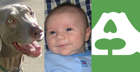
Obviously, neither dogs nor one-year-olds understand much vocabulary. They have no idea what you’re saying so the tone is all you’ve got. More often than I’d like, my dachshund will get into my trash can and will dump a bunch of trash everywhere in the process. My tone alone is enough for him to know how I feel about seeing gum wrappers, used tissues, and Netflix adhesive strips all over the studio. Heck, I could recite Shakespearean sonnets and use a disappointed tone and he’d know how I felt. What I say isn’t as important as how I say it. He gets the message… my tone is enough.
It goes the same way with people (and most notably babies), they can tell if you’re happy or not. As a child develops vocabulary their understanding of the nuances of the words and the shades of meaning develops, but early on you really don’t have much to work with. As a parent you communicate in mega themes: what you did makes me happy, what you did makes me sad, what you’re doing makes me wish I had never procreated (okay, a bit harsh). The tone you use is key in communicating these things. I’m curious if the teenage years will bring back these “I’m not listening to what you’re saying but I get the gist” days. I hope not.
Thinking about these instances reminded me of the typography debate and shed some light on my own thoughts about type selection. I’ve always been one to choose the type that I feel is clear and legible but also feels like the content that’s being communicated. If it’s western, I choose western. If it’s modern, I choose modern. At the core of it all, the words may be the content of what you’re saying but the typeface you choose is the tone. As a communicator, I feel it’s important to use impactful imagery and verbiage to share a message in the most successful way possible. Paying attention to the “tone” of that message via appropriate typography choices is a big part of it. And by placing importance on choosing the right type, the message will be communicated more clearly.
My dogs and my kids said so.
Be the First to Comment