If you design for the web, you know (or should know) how challenging it is to design a site that is functional, flexible, and also aesthetically appropriate for the client and the content. For years I have been talking with developers about and have, myself been using separate style sheets, separate domains, specified scripts, and other witchcraft to make sure the content reached as many guests as natively as possible. And at the end of the process, I completed sites that worked, but were very time-consuming, required very specialized knowledge, and a mess to go back into to update.
This summer, a developer friend of mine told me about media queries and about the book Responsive Web Design by Ethan Marcotte. I’ve read a number of books from A Book Apart and have never been disappointed. I picked up a copy and it was then that I knew two things:
- This would change everything.
- I needed to try it out with my own redesign.
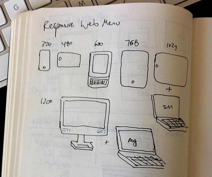
Well, now that I have completed this site as a responsive site that self-formats based on the device on which it is displayed, I have several quick bits of knowledge to share.
- If you know CSS, media queries are super-easy. You’ll pick them up very quickly.
- When designing responsively, the designer must closely consider how the page will evolve as it is modified for each device. This means that designers have to focus more on developing a tool for information delivery instead of a fancy, drop-shadowed, textural, image-fest that will never change and the creator’s vision will last forever (in web time, that’s 2 years). I learned very quickly to plan for the evolution of the site after developing version 1, which was an utter failure once it I started implementing media queries.
- Responsive web design is the answer. I’m convinced that this is the correct way to develop for web in a way that respects the reader and honors the content, simultaneously.
- Don’t develop a site like this while in graduate school and working at the same time unless you abhor sleep.
That’s the short story of it… I plan on writing a paper to share my experiences developing this site and am also using what I learned to inform a very large-scale site I am designing with a developer that will launch before year’s end. I’m sure I’ll keep posting updates as I learn more and as the site gets used in ways I never intended or tested.
I’m excited to see what designers will do with responsive as they create sites that are more tools for information dispersal, than iconic monoliths of permanence. I’m convinced that the flexibility of responsive web design will allow more of our users to engage with content, wherever they are and whatever they’re using.
…for more on responsive web design, check out www.mediaqueri.es, a showplace for responsive web design that’s emerging.
2 Comments
Thanks
Leave a Reply