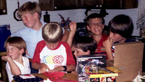
In 1984 we took a family vacation to Walt Disney World in Orlando, Florida. I was nine and hadn’t even dreamt of a career in design nor was I aware that it even existed. But looking back now, I recognize that the symbols and branding at EPCOT Center were the beginning of my design education and my love of simple, elegant, and visually appropriate design. This post is a review of the Logos of EPCOT Center, designed by Imagineer Norm Inouye.
Thanks to commenter How Bowers for bringing Norm Inouye to my attention. When this post was originally written, I could not find who designed these marks. More on Inouye at The Disney Elite.
EPCOT Center opened in 1982 and was a theme park composed of two different sections. Future World consisted of eight or so pavilions that each highlighted a major, global social issue or research area. There was a pavilion about communication, one about imagination, and one on agriculture to list a few. World Showcase was the second section of EPCOT Center where nearly a dozen national pavilions were built to showcase the accomplishments and cultural diversity of different nations. Countries like Mexico, Norway, Japan, and the United States were represented.
I write all of this in the past tense because I’m writing about the original EPCOT Center. In 1994 Disney renamed it Epcot and its focus has changed a great deal since, but many of the original attractions are still there and I’ve visited three times in the last ten years. Also since 1994, the original pavilion logos in Future World have been removed, one by one. While I recognize the original marks look a bit dated (a difficult thing for me to admit, as nostalgic as I am) I feel that an update would have been preferred to complete removal. Nevertheless, what’s done is done. It doesn’t change the fact that these original marks had a huge impact on my design sensibility and my later decision to become one who enjoys using visual language to communicate larger concepts.

All of the EPCOT Center logos were built off of the circle shape. The EPCOT Center logo itself was a collection of circles containing a globe with styled longitude and latitude lines. The main icon resembled shapes echoed in science: a pentagon implied around the outer perimeter of the mark, the interlocking circles resembling helixes, and ensuing diamond and triangle shapes. Even some of the lines connect and flourish to resemble lines found in biology in cellular structure. Overall, its radial nature makes it feel like a place where many objects converge into one.

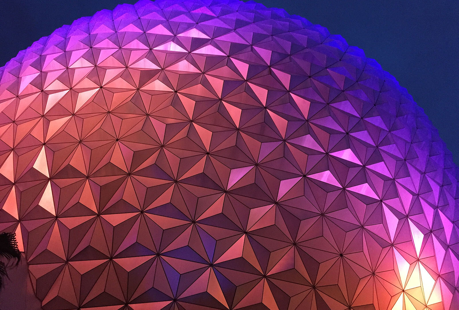
The cornerstone of EPCOT Center was the attraction Spaceship Earth. If you’re familiar with EPCOT Center you know it as the huge “ball” at the front of the park. The logo for this attraction doesn’t say as much about the focus of the attraction which is human communication, but it depicts its “spaceship” aspect well. There’s a nice use of positive and negative space here as the globe streams from left to right and leaves open trails behind it.

Universe of Energy was a pavilion dedicated innovation in energy technology. The logo generates its own movement and energy through the use of increasingly thinner lines as they move away from the center. Energy is kinetic, and this mark does an excellent job of capturing its radiant nature while remaining visually interesting. Notice how the mark “vibrates” as your eye moves over it. This is a symptom of the moire pattern created by the radial lines.

The next pavilion, moving clockwise, was called Horizons. This pavilion was dedicated to the general idea of living in a future inspired by innovation. The mark mimics Universe of Energy’s logo in its use of thin and thick lines to create movement. The open half-circle “horizon” suggests light, and the concept of a bright future, highlighted by the use of a thick half-circle line to show contrast and to call attention to the open area it contains. The viewer’s eye easily moves toward the horizon and the open space created as a result of the use of line and contrast.

World of Motion was a pavilion dedicated to the concept of transportation. Of all of the EPCOT Center logos, this one uses negative space the best. The mark is not “closed” like the other logos, but allows the open space to flow throughout. The mark shows movement with elegance, with the object at the center of the icon pushing through the lines and causing them to cup around it and stream away in aerodynamic trails. While the circle is at the center of the icon it still feels like it’s moving, thanks to the streaming lines.

At the center of EPCOT Center was CommuniCore. These semi-circled buildings housed exhibits that addressed a variety of future-looking topics and technologies. This logo actually looks like the rounded CommuniCore buildings themselves. Because these buildings were multi-function, it was uneccesary for the logo to suggest a certain technology, rather highlighting the “core” aspect and the building shape was a far better direction. The use of negative space here highlights the open circle at the middle, revealing the core.

The next pavilion, moving clockwise was Journey Into Imagination. This pavilion addressed the topic of imagination and creativity. The mark uses a thick circle line and thinner radiating lines to create a whirling pinwheel image. This combination creates movement wheeling away from the center circle but also remains somewhat whimsical thanks to the half-moon pinwheel shapes. Of all of the topics addressed at EPCOT Center, Imagination is the most abstract and I feel the designer succeeded in capturing the concept of the genesis of creativity through the use of spiraling shapes.

The next pavilion was called The Land and it addressed issues of agriculture, food production, and land management. As one of the more literal concepts at EPCOT Center, the logo for The Land simply takes the globe shape and bends longitude and latitude lines to show a plant. It’s not the most innovative mark of the bunch, but does communicate global agriculture easily and it matches the other marks in style. Still, the mark is pleasing to look at as you examine the intersections of the lines as they combine to create the plant image.

The Living Seas was the final pavilion moving clockwise around the circle of Future World. When it was built, it housed the largest aquarium in the world. The Living Seas addressed the exploration, preservation, and management of the oceans. The mark is reminiscent of The Land logo in its literal handling of the subject matter but is still successful in communicating the ocean in a simple way.
Overall, the suite of EPCOT Center logos is successful in working as a family of marks while communicating a variety of topics. I’ve not been able to track these down to a single designer or a design team, so I will have to credit them to Walt Disney Imagineering. It’s a shame their work is no longer seen at Epcot but it has not been forgotten by Disney enthusiasts and designers like me.
14 Comments
Thank you for the run down on the EPCOT designs. I came across a few very interesting tshirts at the Walt Disney Imagineering gift store on my lunch break. I bought a black tshirt with a bright green The Land logo on the chest. Fell in love with the design, after reading your article I will go back and buy the World of Motion shirt as well.
I had no idea EPCOT logo shirts were even available… mkes me wish I could pick up a Spaceship Earth one on my own lunch break!
I love the retro Epcot symbols as well and was never able to find the kinds of shirts I liked…. until now…. Check out a site called RedBubble and look for a user called “AngrySaint”. Enjoy the Retro Epcot shirts!!!
The Imagination logo also looks like iris of a camera lens, which would fit in with the Kodak connection.
Why you skipped wonders of life?
That’s a great question! I stuck to the “original” group of EPCOT Center pavilions (the same reason why Mission:Space was not reviewed). The original pavilions had a cohesive visual language that was lacking in later developments.
My 7 yr old son started noticing these marks on pins. They live on
The logos were designed by Norm Inouye.
Thanks for bringing Norm to my attention. Hard to believe I couldn’t find this information when I wrote this post in 2010. I’ve updated the post to credit Inouye.
Really great post. I would be really curious to see a proposed redesign based on the current pavilions in a more modern style
What a cool idea! A modern re-fit would be a fun project.
We were there the same year! And I have the same shirt: 1984 seems to have been a pinnacle of sorts for that park… although Spaceship Earth was closed when I visited, as it’d been hit by lightning, and the Living Seas exhibit hadn’t opened yet. Still, what a unique park experience EPCOT was then, for a nerdy kid more interested in city planning and in science than in princesses and mice.
But mostly I wrote to say: I wouldn’t call the logos dated at all, but rather timelessly optimistic, the way much mid-to-late-‘70s through earliest ‘80s (maybe ending around ‘82) visual design and typography is: all curves and rainbows and stars and bold strokes and colors, always implying bold and exciting frontiers yet smooth transitions, with unity in diversity.
Considering we’re now nowhere closer to those utopian goals, which in the ‘60s and the ‘70s felt right around the corner (in some ways, socially, perhaps we’re even further away from them) it might be justified to hang onto such design, the way we still endlessly quote — or even outright copy — mid-century modern style in all of our architecture and furniture: it remains timeless in still seeming to be from some better future. And who knows: maybe 1945-1969/70s _was_ that better future… I mean, even in areas where we lagged badly (civil rights) at least we’d begun trying!
So yeah, if you were to proclaim those logos timeless rather than dated, I’d be totally on board. If you want to start a movement to bring back design and typesetting which looks like a combination of a vibrant ‘70s Sesame Street Magazine issue with a futuristic episode of Electric Company or Zoom! (check out their aesthetic if you’re unfamiliar) and make it timelessly current, I’ll help as best I’m able… and I think the world would thank us! Design which implies joy and unity and cooperation as both timeless and current may be what people still need to inspire them.
Anywho, thanks also for posting all those logos in one place! They bring back fond memories… and they’re inspiring, still!!
Thanks for such a thoughtful response! Yes, I think some timeless design (or throwback aspirations) would do our society a lot of good these days. I am very curious to see how EPCOT will evolve over the next five years as the part receives a huge update.
I hope it remains inspiring and captures the hope it was designed to instill. If not, then those of us whom it inspired all these years will just have to make that future world a reality for all people today. Gee, I sound like I am reading the script for Horizons.
Found a cool EPCOT logo shirt. See link On Flickr.
Leave a Reply